
Your Competitor Comparison Landing Page Is Losing Because You're Fighting the Wrong Fight


The page isn't the problem
Most SaaS comparison pages read like a wrestler who wandered into the wrong arena.
The copy is clean. The table is tidy. Every row has a green checkmark next to your product and a red X next to the competitor. You shipped it, linked it in the footer, and waited for deals to roll in. They didn't.
The page itself is usually fine. The team just picked the wrong type of page without realizing they had options. There are at least four distinct playbooks for a competitor comparison landing page, and the differences between them matter. They target different buyers, at different moments of doubt. Build a head-to-head "you vs. them" page when your buyer wanted a quiet exit ramp and you have built the wrong page. Build a soft "alternative to" roundup when the prospect was already ready for a knife fight, also wrong page.
Same product. Same competitor. Same traffic. Very different conversion rates.
Buyers searching these pages are already unhappy. Somebody at the other vendor's Slack channel is venting. Someone on Reddit is asking if switching is worth the hassle. By the time they type your competitor's name plus "vs" or "alternative" into Google, they have already decided the real question is no longer if, it is who. Your comparison page is the first thing they read after they gave themselves permission to leave.
Give them a generic spec sheet at that moment and you lose them. Give them a real answer to the switching question and you close deals your sales team never had to touch.
This post walks through the four fighters: when to use each one, how the best SaaS brands execute them, and how to pick the right one for your buyer.
What is a competitor comparison landing page
A competitor comparison landing page pits your product against one or more named competitors on your own site, and it is built to convert rather than to inform.
That distinction is the whole game. A blog post that mentions competitors is an article. A competitor comparison landing page sits closer to your pricing page in intent, and it works as a sales enablement asset the same way a demo script or a one-pager does. It exists to catch somebody who is already shopping and move them toward a trial, a demo, or a signup.
These pages earn traffic two main ways. They rank on bottom-funnel search terms like "[Competitor] alternatives," "[Competitor] vs [Your Product]," or "best [category] for [use case]." Or they get linked from sales emails, outbound sequences, and paid ads when a rep knows the prospect is weighing a specific alternative.
A comparison landing page done well confirms what the buyer already suspects about the other tool, gives them an honest reason to try you, and saves them the work of running a side-by-side evaluation themselves.
A comparison landing page done poorly reads like a press release with a feature grid taped to the bottom.
Picking the right fight matters more than how cleanly you execute it.
The four fighters
Every effective competitor comparison landing page is really one of four archetypes. Each one answers a different buyer question, and each one is the wrong choice in the wrong situation.
Fighter #1: The Heavyweight (Direct VS). You vs. one named competitor. Big brand stakes a claim, invites the comparison, and argues its side.
Fighter #2: The Tactician (Alternative Roundup). "[Competitor] alternatives." Your product is one of several options for buyers who have already decided to leave the incumbent. Lower ego, higher volume.
Fighter #3: The Mediator (Referee). You compare two other tools, neither of which is you. A trust play. You become the authority who helps the buyer decide, and the default third option when they don't love either A or B.
Fighter #4: The Authority (Category Builder). You compare yourself to a dominant legacy tool that defines the category. Less a feature fight, more a generational one. Old way, new way.
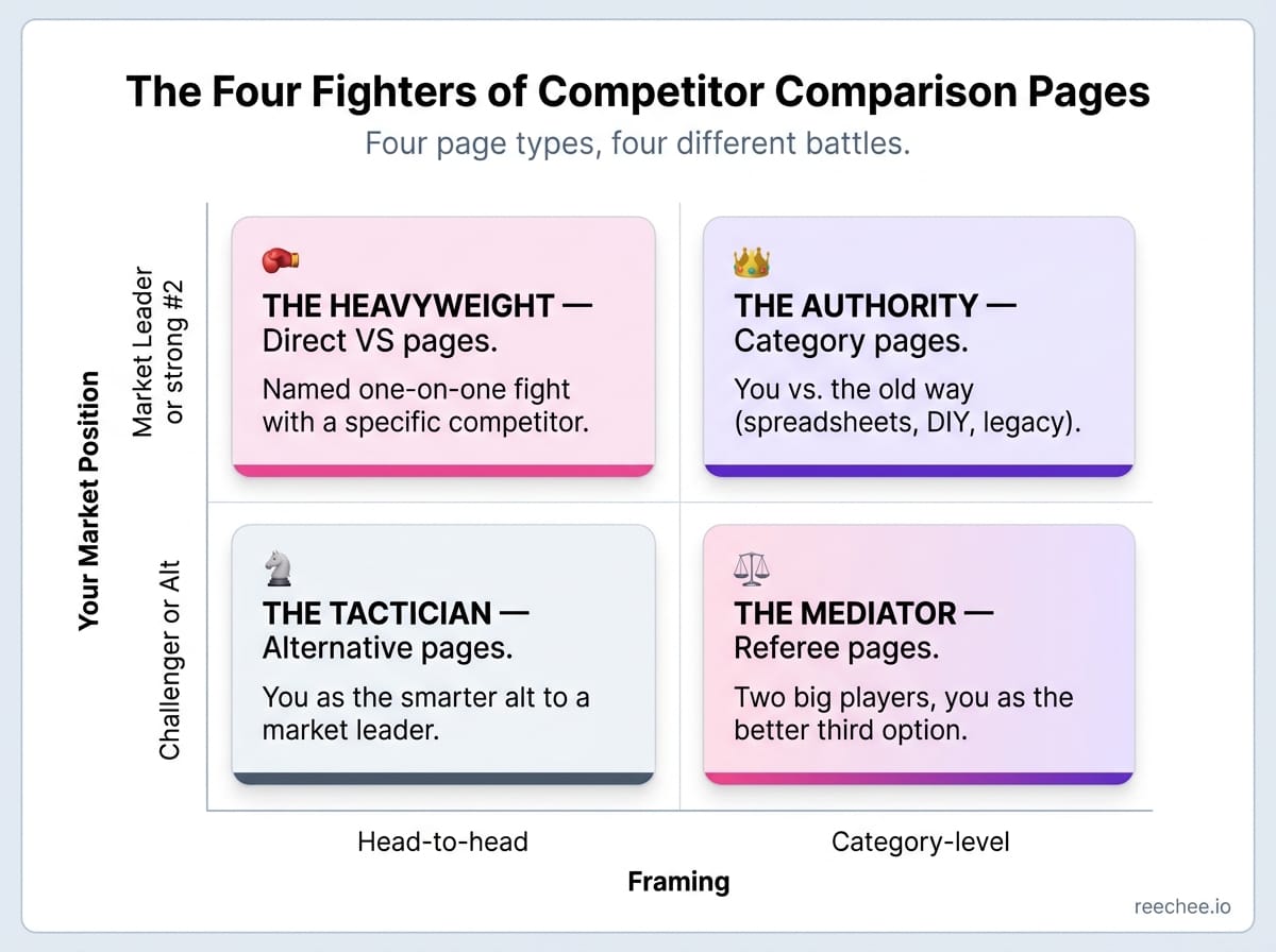
The rest of this post is a tour through each fighter, with real examples you can steal from.
Fighter #1: The Heavyweight (Direct VS)
When to use it: You have real product parity or advantages against one specific competitor, and your brand is strong enough to survive the comparison. Your buyer already knows both names. They are explicitly searching "[You] vs [Them]" or landing on the page from a rep's email.
What the page does: Names the competitor. Frames the specific reasons a buyer would choose you. Backs the claims with screenshots, pricing, integrations, migration support, and ideally a customer quote from somebody who actually switched.
Risk: You are picking a public fight. If your product loses on the table, the page actively hurts you. If you overstate capabilities, the comparison sites and Reddit threads will fact-check you in real time. Think of it as a public version of your internal sales battlecard with the same accuracy bar.
Examples worth studying:
Fillout's "Fillout vs Typeform" page runs the playbook cleanly. It opens with a clear positioning line, builds a side-by-side feature table, names specific Typeform limits (form length caps, logic restrictions, pricing at scale), and makes switching feel low-risk with a migration section. Fillout is the younger product. They win on flexibility and price, and the page is built around those two angles, not a fake "better at everything" claim.
PostHog's "PostHog vs Mixpanel" page takes a similar route for product analytics. They score themselves honestly, including admitting where Mixpanel wins, which is what makes the rest of the page credible. Buyers who sense spin tune out. Buyers who sense honest self-assessment lean in.
Supabase's "Supabase vs Firebase" runs the same play against a much bigger incumbent. Firebase is a Google product. Supabase never pretends to have equivalent scale or ecosystem. Instead, the page concedes the points where Firebase wins and focuses the argument where it loses: open source, SQL, data portability. The concession is what makes the pitch land.
The Heavyweight works when you can answer one question without hedging: if this buyer reads nothing else and decides right now, what are the three things they need to know? Can't answer that cleanly in one page? Then this is the wrong fighter for this competitor.
Fighter #2: The Tactician (Alternative Roundup)
When to use it: The competitor is dominant enough that buyers search for alternatives by name ("[Competitor] alternatives") rather than for your specific tool. You need a way to enter the conversation without claiming you personally beat the giant.
What the page does: Lists 5 to 10 alternatives, including yours, gives each one a fair summary, and ranks or groups them by use case. Your product is one of the options, ideally listed first, with a subtle edge in the write-up.
Risk: It looks like an honest roundup. Buyers smell a rigged one immediately. If every non-you option gets a lukewarm paragraph and yours gets the hype, trust collapses in about ten seconds.
Examples worth studying:
Tella's "Loom alternatives" page is a strong one. Loom is the category leader in async video, so Tella cannot plausibly run a Heavyweight page against them. Instead, Tella writes a legitimate roundup of Loom alternatives, lists itself among them, and lets the product demo and pricing do the persuasion work. The page ranks, converts, and doesn't trigger the "I'm being sold to" reflex.
Kustomer's "Top 20 Zendesk Alternatives" page takes similar approach. Zendesk has 50,000+ paying customers and brand gravity Kustomer cannot match head-to-head. So Kustomer does not try. The page opens with real Reddit threads and G2 reviews venting about Zendesk's price hikes after its $10B private equity acquisition, then lists 20 alternatives, ranking Kustomer first but giving every competitor a fair write-up with pricing, pros, and cons. The sourced frustration at the top is what makes the pitch land.
The Tactician is the highest-leverage fighter for challenger brands. Let the volume come from the competitor's name, then use the roundup format to sell yourself without ever claiming you beat them head-to-head.
Fighter #3: The Mediator (Referee)
When to use it: Two other tools dominate the category, your brand is not yet big enough to beat either head-to-head, and buyers are torn between those two. Search volume is high on "[Competitor A] vs [Competitor B]."
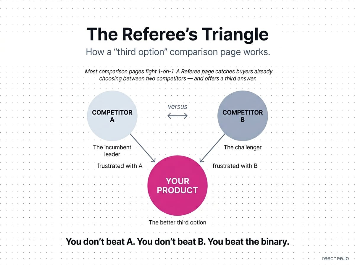
What the page does: You become the referee. The page honestly compares the two rivals, helps the buyer pick between them, and introduces your product, almost in passing, as the third option for buyers who decide neither A nor B is quite right.
Risk: This is the highest-trust, lowest-volume fighter. If the comparison is not genuinely useful, buyers notice the angle and bounce in five seconds.
Examples worth studying:
Cal.com's "Calendly vs Doodle" comparison is a good mediator page. Cal.com compares two of its own competitors thoroughly and fairly. At the end, it introduces itself as the open-source alternative for buyers who want a different flavor of scheduling tool. The page ranks on "[Calendly vs Doodle]" queries that Cal.com would otherwise never touch.
Woodpecker's "Lemlist vs Instantly" comparison does the same in cold email. Lemlist and Instantly are stronger brands in that niche. Woodpecker is the elder statesman positioned as a quieter third path. The article ranks, the buyer gets real value, and Woodpecker gets a subtle but effective wedge.
Ghost's alternatives hub rolls multiple Mediator plays into a single hub architecture. Great for internal linking, and great for capturing every "[X] vs [Y]" query in a space.
The Mediator is the fighter most teams overlook, which is why it's underpriced. The volume is real. The trust signal is strong. And the competition for these queries is often lazy affiliate content you can out-execute with thirty focused minutes of honesty.
Fighter #4: The Authority (Category Builder)
When to use it: You are defining a new way to do an old job. The incumbent defines the category and has most of the market. You are not competing on features, you are competing on approach.
What the page does: Less head-to-head comparison, more "here is how the job has changed" argument. Features get mentioned, but the real argument is about workflows, generations, and where the industry is heading.
Risk: Too abstract and it reads as manifesto fluff with no purchase decision attached. Too concrete and you lose the generational story that makes the page worth reading.
Examples worth studying:
Webflow vs WordPress is the archetypal Authority page. Webflow does not argue it has more features than WordPress. It argues that the old way of building sites (plugins, hosting, security patches, developers on call) is the wrong job for most modern teams, and a visual builder with hosting baked in is a different generation of tool. The comparison is philosophical with a pricing page attached.
Airtable vs Smartsheet frames itself the same way. Smartsheet is the spreadsheet-plus-projects incumbent. Airtable argues it is not a better spreadsheet. It is a relational database dressed as a spreadsheet, which is a different category entirely. The comparison is won or lost on whether the buyer accepts that framing.
The Authority fighter is the hardest to pull off because it requires a real category story. Fake ones get torn apart on Twitter within a week. Real ones compound over years.
How to pick the right fighter
A short decision guide, because most teams do not need every fighter on their site.
Start with who you are. Incumbents can run Heavyweights. Challengers usually lean Tactician or Mediator until the brand is big enough to name names. Then look at search volume. If the competitor dominates the space, a Tactician page usually wins on traffic. If volume is more balanced, a Heavyweight earns its keep. Then ask how your product is actually different. Philosophical difference points toward Authority. Execution difference points toward Heavyweight or Tactician. And if the category has a messy two-way fight at the top between two of your competitors, the Mediator is the sleeper pick almost nobody builds.
Most SaaS companies eventually run two or three of these, each against different competitors. A single product can be a Tactician against the category leader, a Heavyweight against a close peer, and a Mediator in a neighboring space, all at once.
How to find competitors worth comparing against
Competitor lists built in a conference room are usually wrong. The names your team argues about internally are rarely the names your buyers are weighing.
Better signals, in rough order of quality:
- Search data. Pull "[your category] alternatives" and "[your product] vs" queries in a keyword tool. The autocomplete suggestions on Google are gold for this.
- Win/loss calls. Sales knows the real shortlist. Product marketing knows which names show up in deal notes. These overlap heavily with your buyer intent signals.
- Review sites. G2 and Capterra category pages will show you who buyers group you with, whether you like it or not. The "also-considered" sections are particularly useful, and they double as a buyer-intent signal source when reviewers complain about specific pain points.
- Support tickets and cancel reasons. The tool people switch from is a different list than the tool people switch to. Both are worth comparison pages.
- Reddit and niche communities. When a buyer asks "has anyone tried X or Y?" and you are not in the answer, you need a page that puts you in the answer.
A quick heuristic: if a competitor shows up on all five of those lists, that is a Heavyweight page. If it shows up on three, probably Tactician. If it shows up on one, usually review sites, skip it or save it for a Mediator play later.
The fighter you can never schedule
All four fighter types assume the same buyer. A person who has already decided they want to switch. Most comparison-page advice ends there.
The real leverage is earlier.
Most buyers do not start their day Googling "[Competitor] alternatives." They start their day annoyed. Something breaks in the other tool. Support takes two days to reply. A feature they assumed was included is gated behind the next pricing tier. A review site fills up with venting from people in the exact same role. The search query, the moment a comparison page gets found, comes hours, days, or weeks after the frustration that triggered it.
If you only optimize for the search moment, you are fighting for a sliver of the buyers who eventually make it to Google. The earlier signal, the frustration itself, is where comparison pages actually earn most of their work. And it is a signal you can monitor, if you look in the right places.
This is the thesis behind Frustration-Led Growth, the approach we built Reechee around. Public reviews, support channels, and niche communities leak competitor dissatisfaction all the time, and social listening across those channels is how you find it early. Surface those signals, point the buyer at your comparison page while the pain is still fresh, and your Heavyweight or Tactician page stops being a passive SEO asset and starts doing outbound work for you.
The fighter you built for SEO is the same fighter you send to a frustrated buyer in outbound. Only the timing changes.
Common mistakes to avoid
A short list of patterns we see often.
The all-green column. Your column has a checkmark on every row and theirs has an X on every row. Nobody believes that. Lose a few on purpose and the rest of the page gets believed.
The generic "we have better support" claim. Every page says this. Prove it with an SLA, a response-time screenshot, or a real customer quote, or drop the claim entirely.
No migration path. A buyer who is ready to switch still has to actually import data. If the page does not address that anywhere, the switch does not happen.
A competitor's logo at the top of your page. Legally dicey, and it makes the page look like a trap.
No human on the page. A customer quote from a real switcher is worth more than a feature table. If you are wondering where to source those quotes, start with your own review flow and the competitors' review pages. Comparison pages with zero human voice feel auto-generated and convert like it.
Writing once and forgetting. Competitors ship. Pricing changes. A comparison page that has not been touched in eighteen months is actively misleading, and buyers notice faster than you think.
FAQ
What makes a competitor comparison landing page different from a blog post?
Intent. A blog post informs and ranks on top-of-funnel queries. A competitor comparison landing page is built to convert buyers who are already shopping, usually with a clearer CTA, a feature table, and a migration path spelled out.
Should I name my competitor directly on the page?
Yes, if you can back up the claims and the competitor's brand will not outweigh yours in buyer trust. The name is what earns you the bottom-funnel traffic. Vague pages that never name names rarely rank.
Do alternative pages work for small brands?
They are often the best fighter for a small brand. The Tactician format lets you ride a larger competitor's search volume without claiming you personally beat them.
How many competitor comparison landing pages should a SaaS company have?
Start with one for your most-mentioned competitor. Add a second once the first earns traffic. Most healthy SaaS sites end up with somewhere between five and fifteen, some Heavyweight, some Tactician, sometimes one Mediator.
How often should I update these pages?
Quarterly at minimum. Competitor pricing and feature changes outdate your claims fast, and a wrong claim on a comparison page is worse than no claim at all.
Pick your fighter
Every SaaS comparison page is a bet on what your buyer is doing in that exact moment. A Heavyweight bets they already know the shortlist and just want your argument. A Tactician bets they are leaving the incumbent and open to options. A Mediator bets they are stuck between two names and will trust the referee. An Authority bets they are ready to question the whole category.
Pick the wrong bet and no amount of design work, copy polish, or feature grids will save the page.
Pick the right one and the page does work your sales team never has to.
One question to ask before you write a single line of copy: which fight is my buyer actually in right now? Build for that fight. The rest of the page mostly writes itself.